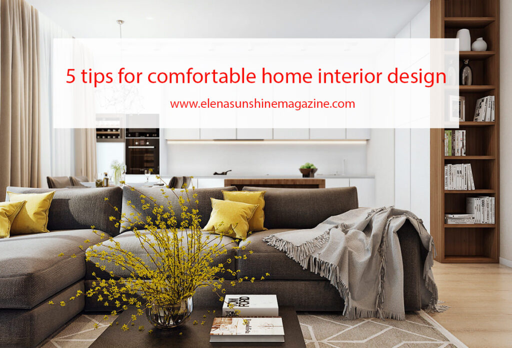
Surely you have never noticed that you are comfortable in some rooms, but you want to escape from others as soon as possible. Why the interior is annoying, and what needs to be changed to feel comfortable in the house? 5 tips for comfortable home interior design.
Reasons why I don’t like the interior. 5 tips for comfortable home interior design.
#1. There is a lot of visual noise – we are talking not only about bright aggressive ornaments but also about a large number of things on shelves, cabinets, racks, and other surfaces. Try to leave only the most beautiful and necessary things in sight, and make a harmonious composition of them. Hide everything else in the closet, drawer, and other hidden storage systems, otherwise, you will not be able to achieve order and a sense of comfort.
#2. Too active pattern – it often happens that in the store you get excited about wallpaper with an abundance of colors, geometric shapes, and repeating patterns, but as soon as you paste them over the walls in the room, the opinion changes to the exact opposite. Such ornaments cause fatigue, and sensitive people even have associations with their own lives: there is a feeling of a vicious circle and hopelessness.
#3. Boring environment – there is a very fine line between excess and bad taste. In order not to cross it, many people decide to be safe and choose a simple, clear, and proven style, for example, classics or minimalism. The result is a neutral, restrained, and most importantly – stylish interior. But you may be bored with it. To prevent this from happening, study your interior preferences. It is quite possible that you choose a laconic hi-tech in order to avoid mistakes, but in fact, your soul requires a relaxed boho.
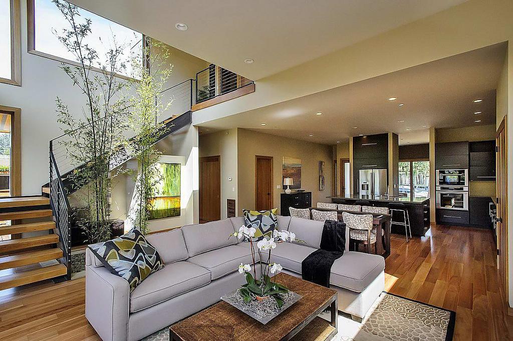
#4. Inappropriate color or combination of colors – it is the color scheme that creates a certain mood and atmosphere in our apartment. Different shades can relax, cheer up, anger, cheer up, etc. If the interior annoys you, check the saturation: the abundance of red, pink, and yellow in a small space can be tiring. Despite the fact that outwardly these colors look positive and harmless, in large quantities they can provoke conflicts and aggression.
#5. All the details of the interior are plain – in addition to the previous point, it is worth saying that when you design an apartment, you should not get carried away with a strict style. Monochrome curtains, wallpaper, and bed linen should be diluted with something contrasting. It’s not just about shades, but also about textures. Feel free to mix textures, patterns, and shades, because you are the main designer of your life. The monochrome color scheme deprives the apartment of vital energy, which means that it does not allow you to feel comfortable in such an environment.
Tip: Before combining two colors in one interior, check them for “color conflicts”. When one color causes a feeling of peace, and the other one excites and calls for decisive action, psychological discomfort appears. You either don’t have the strength to get out of bed and do things or the energy – you start, quit in the middle, and then start again.
In most cases, the wrong color scheme is to blame for everything. We tell you about the different shades in more detail so that you can decide on the color that suits you.
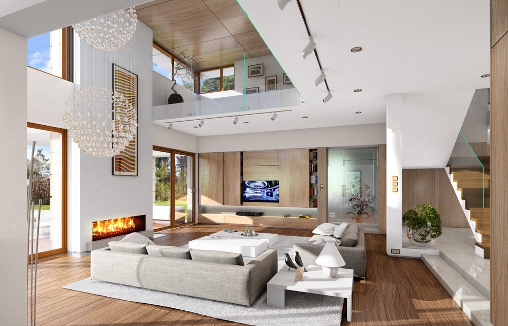
What tasks do different colors solve? 5 tips for comfortable home interior design.
1. Green
No wonder this color and its shades are now the most popular. The secret is that it is the most harmonious and pleasant to perceive. Green helps to calm down, overcome fatigue, and concentrate on the task.
2. Blue
The main function of color is to calm and relax, but if you use it in large quantities and do not dilute it with another shade, it can cause depression.
3. Yellow
It is ideal for the design of the workplace, as it invigorates, helps to concentrate, and does not allow you to sit in one place, idly. For the same reason, you should not use yellow in the bedroom.
4. Purple
Most often it is chosen by creative people, as it is beautiful, sensual, and inspiring, symbolizing the beginning of something new. However, this color has a minus – it quickly gets bored and begins to press.
5. Gray
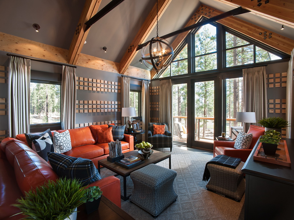
Initially associated with boring offices, but then became popular in the interiors of apartments, as it calms and pacifies. The gray color helps to temporarily turn off emotions and look at the problem with a fresh look. By the way, this shade is ideal for a couple’s home. The most important thing is to find a suitable companion shade.
6. White
For some people, it is a neutral color, and for others, it is a resource color. It is associated with lightness, freshness, and spaciousness, but if you choose the wrong shade, the interior will turn out dry and faceless.
How to choose your palette? 5 tips for comfortable home interior design.
The interior should harmoniously combine two colors – transformational and resource. The first is necessary to replenish energy after completing complex tasks, and the second gives this very energy. To determine which shade is a resource for you and which is transformational, observe your impressions of different colors.
Then you will need to decide on a suitable combination – think about which combination appeals to you the most – and you need to use it for interior decoration. If the size of the room does not allow it, use only the resource color. You can choose the decoration and furniture of the right shade, and buy the right decor.
By the way, for many people, white is a resource. It is especially often used by those people who do not know which path to choose and in which direction to move on. It is not for nothing that it is compared to a blank canvas, which helps to reset and find inspiration.
Another advantage of white is that it has a positive effect not only on the psychological but also on the physical condition – it extinguishes feelings and adds energy. Complement it with another color suitable for your purposes, and you will get the perfect combination.
Here are some more tips:
yellow – for those who are working on a complex project and need energy;
red – for those who want to feel safe;
brown – for those who lack self-confidence;
turquoise – for those who strive to achieve their goal;
blue – for those who are tired of working day and night and need rest.
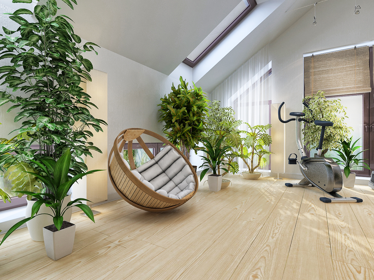
There is no need to change the color of the entire apartment, including walls, floor, ceiling, and furniture. Sometimes, in order for the interior to stop annoying you and sparkle with new colors, it is enough to add bright textiles, a poster, or transplant a plant into an original pot.
But the most important thing is to listen to intuition and your inner voice: our body unconsciously reaches for what it needs most at the moment. So think about it: if you suddenly liked a blue vase in the store (although you don’t like this color too much), maybe you are tired of the eternal time pressure and it’s time to take a vacation.

