Railroad/shotgun style apartments are not just housing, but a space that tells its own unique story. Inspired by style, this apartment transforms the mundane into something extraordinary. 6 spectacular and harmonious color combinations for railroad/shotgun style apartments.
The main advantage of the railroad/shotgun style is its functionality. These apartments are not only beautiful, but also comfortable to live in. This style allows you to use the space to the maximum, creating cozy areas for relaxation, work and creativity. In addition, the railroad/shotgun design style is perfectly combined with modern technology, which makes such apartments even more attractive to young people.
(1) – “Interior decoration-themed spaces that adapt to emotional needs should make full use of psychology, environmental behavior, and innovative design techniques to create spaces“.
#1. Unique interior. Most railroad/shotgun style apartments are located in historic buildings. Many of them still have unique architectural features (high ceilings, exposed brick walls, and more elaborate moldings).
#2. Availability. Apartments in this style are common in large cities.
#3. Don’t be afraid to experiment with lighting. Loft style lamps will create a unique atmosphere.
#4. Use artificial accents such as paintings and mirrors to add airiness.
#5. No empty space — All available space in railroad/shotgun style apartments is inside the room and can be used.
#6. Choose high-quality materials. Cheap substitutes for natural ingredients worsen the perception of design solutions.
Check out the recent Rent. article we were featured in:
Railroad apartment style, a unique and practical layout often found in older urban buildings, has gained popularity for its charm and efficiency. In cities like New York City, Chicago, and San Francisco, these apartments have become a hallmark of compact living.
Read the full article here: Railroad Apartment Living: A Blend of Style and Simplicity| ApartmentGuide | Redfin
Keep the colors cohesive and neutral. 6 spectacular and harmonious color combinations for railroad/shotgun style apartments.
When you’re trying to make a space feel more spacious and open, light neutral colors are best. These include white, pink, cream, light gray, beige, and gray. If you like dark and bold colors, feel free to set accents with these tones to add interest to the design.
Graphic, delicate, enveloping — we are considering cool color combinations.
#1. In a pastel palette with green color
The interior range is based on a combination of green shades and pink tones of varying saturation. This helps to create a fresh, moderately bright and pleasant atmosphere. The interior looks spectacular, the combination is airy, gentle, and not flashy.
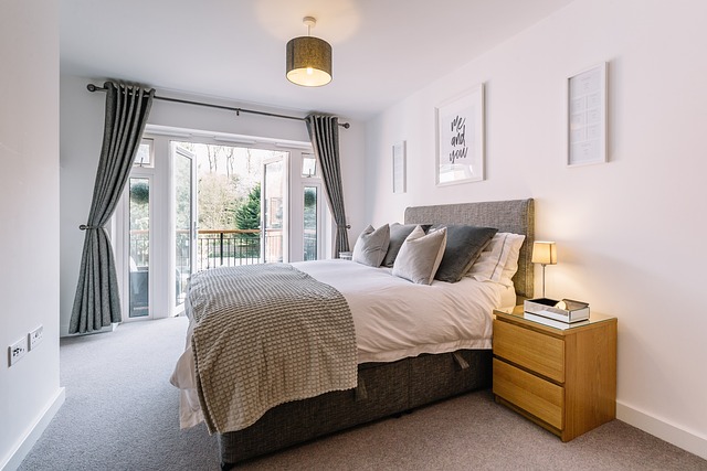
On a small area, you can place a separate full-fledged bedroom, decorate the balcony, making an additional place to relax, provide a kitchen set with a large work surface and storage areas in the living room, additional beds (a pink sofa bed) and a sliding table in case of guests.
The duet of pink and green shades is so popular for a reason: it combines tenderness and freshness, warmth and coolness, and depending on the chosen tones, it can look romantic, bright or elegant. Since both colors are self-sufficient, you need to distribute the proportions correctly in this combination. One must be the leading one in the palette, and the other must be an additional one. If both shades seem too bold to you, they can be diluted with any neutral background: white, gray, beige.
To make the combination look harmonious, choose color variations so that they match the temperature. For example, olive oil will look good with peach, tea rose, powdery. And emerald or mint — with colder tones, slightly fading into purple. When making a range, draw inspiration from nature with its flowers in the garden or meadow.
In psychology, pink has several basic meanings.
Firstly, femininity and tenderness, which is why it is so often chosen for decorating women’s interiors, boudoir bedrooms, and dressing rooms.
Secondly, it is associated with childhood, tranquility, and security, so it is great for the nursery. In addition, pinkish shades have a physical effect.: they relax, relieve stress, and sometimes even relieve headaches.
Lighting
Ceiling chandeliers in the same style were chosen for the kitchen living room and bedroom. Additional lighting scenarios include sconces in the bedroom, spotlights above the sofa and kitchen, and hidden illumination of the kitchen’s work surface. The bathroom has built-in ceiling lights, a mirror suspension and contour lighting of the shower area. There are built—in ceiling lights in the hallway.
#2. Interior design in beige, gray and red colors. 6 spectacular and harmonious color combinations for railroad/shotgun style apartments.
The basic element of the palette is classic beige. Like gray, it has many variations: from delicate creamy to denser coffee and shortbread. Beige in this case works the same way as white or light gray – it’s a great neutral background.
Only due to the warmth the room looks more comfortable. If achieving this effect is the main goal, especially when the windows of the room face north, you can leave only these colors in the palette or even enhance the warm color scheme with muted red.
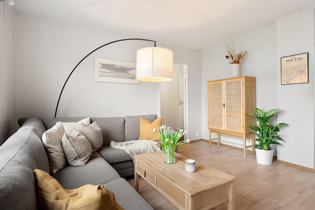
Almost always, neutral shades require bright companions — at least in the form of small color spots. So, in the living room there is a combination of beige, gray and bright red accents. There are very few of them, but they make the interior look more stylish. The palette is based on a light beige shade – the sofa is matched to the painted walls. They were complemented with dark gray curtains. Red elements in textiles and decor became bright strokes.
#3. How to use beige in an interior with an orange accent. 6 spectacular and harmonious color combinations for railroad/shotgun style apartments.
Beige is considered one of the most comfortable and inviting colors for an apartment or house. It is low-key, warm, and close to natural colors, so it is perceived by the psyche as naturally as possible.
This is a light and warm tone, which means it solves two housing problems at once: small areas and lack of sunlight. In company with white and other nude shades, it adds air to the space, and also gives the room the effect of warm natural light, even on a cloudy day.
Most of the nuances of beige can be found in nature — and there you can see the ideas of combining with any natural tones. Brown, orange, the surface of stones or minerals, ochre, brick, indigo, straw — any of these colors will reveal themselves on a calm neutral background. The richer the tone, the more accentuated it should be.
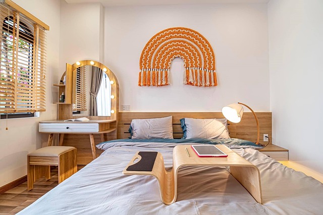
The secret to a successful beige interior is to base your choice of shade not on an abstract palette, but on natural textures. Wood, sand, wheat ears, pebbles, marble veins, straw, and bird’s feather — natural shades and pronounced textures will give the color depth, it will look interesting and voluminous.
When choosing a palette, decide what effect you want to get from the room: a cozy nest, a luxurious austere interior, an elegant space? Depending on this, choose warm or cold shades of beige.
#4. Interior in blue tones with orange: how to create a harmonious and stylish space. 6 spectacular and harmonious color combinations for railroad/shotgun style apartments.
How to use a blue tone to create a warm, cozy apartment in the style of a railroad/shotgun.
This is one of the main base colors. And the coldest in the palette. This tone can bring warmth, harmony and comfort to the house. Interiors in such colors can be refined, noble, elegant. They can also be elegant or restrained and neutral, or they can look bold and even extravagant. The result depends on the specific shade, method and scale of its application.
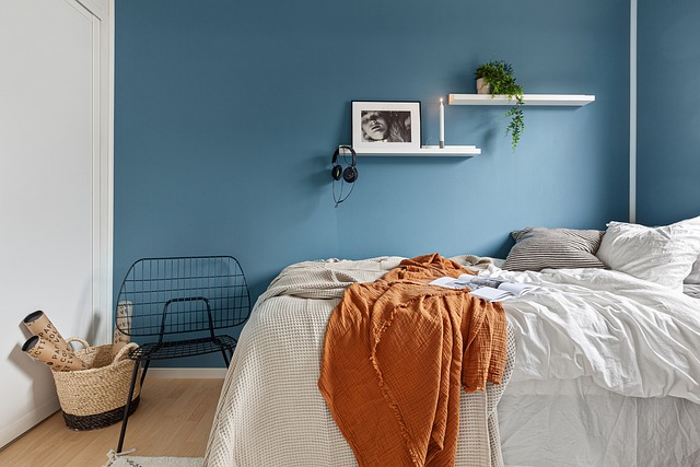
Light blue shades
This is the safest and most versatile interior solution. Muted, light shades are calm, neutral. They are quite capable of replacing beige and even white in the interior, acting as an ideal background and canvas for accent objects. The space turns out to be light and airy. They are suitable for the living room, bedroom, kitchen, hallway, bathroom, dining room — for any room in the house.
#5. Interior design in turquoise and pink color tones. 6 spectacular and harmonious color combinations for railroad/shotgun style apartments.
In general, these are universal elements of the turquoise and pink palette, which looks good in both spacious and small rooms, as a low-key background to replace annoying base colors or a brighter accent.
It is better to take a pinkish tone in a diluted form, it is suitable for the role of a calm, but at the same time interesting background and turquoise will shade it and emphasize it favorably. This combination looks great in the kitchen, as warm colors create the right associations and stimulate the appetite.
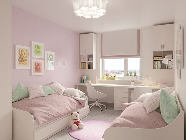
If you want to apply it in the bedroom or nursery, choose the most muted pastel colors so that the colorful environment does not interfere with relaxing and giving your brain a break.
#6. Interior in green colors with orange
When you come home after a hard day’s work, a well-chosen palette of walls and furniture helps you calm down faster and adjust to a positive mood.
In any room, you can decorate the interior in green colors. In the bedroom, muted shades of greenery will have a relaxing effect, helping to better prepare for sleep. In the home office, they will improve productivity and concentration. They can also be seamlessly integrated into small rooms such as the hallway and bathrooms. And they won’t look gloomy in the absence of natural light.
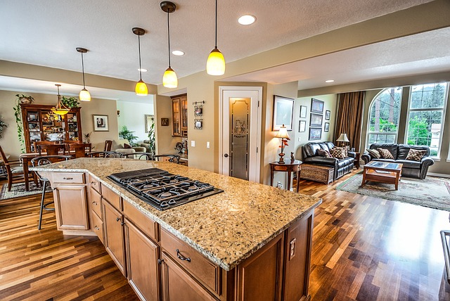
Green and orange is a bright and energetic combination that will also make the interior of the room on the shady side more joyful. And if the sun is shining outside, this palette will sparkle with fancy colors.
For many, it is associated with a contrasting autumn color scheme, when some trees have not yet changed their pigment, while others have already turned into gold.
To summarize, the railroad/shotgun style represents a unique opportunity to transform a living space by adding non-standardness and functionality to it. This is the time to truly create something original.
(1) – US National Library of Medicine; Indoor Color and Space Humanized Design Based on Emotional Needs; Yunkai Xu, Shan Wu; 2022 Jul 13.
https://pmc.ncbi.nlm.nih.gov/articles/PMC9326449/


